Grid systems are a key part of modern UI design. They provide structure and help organize content, making interfaces look clean and easy to use. Without grids, designs can feel messy and confusing, which makes it harder for users to interact with them.

What Is a Grid System?
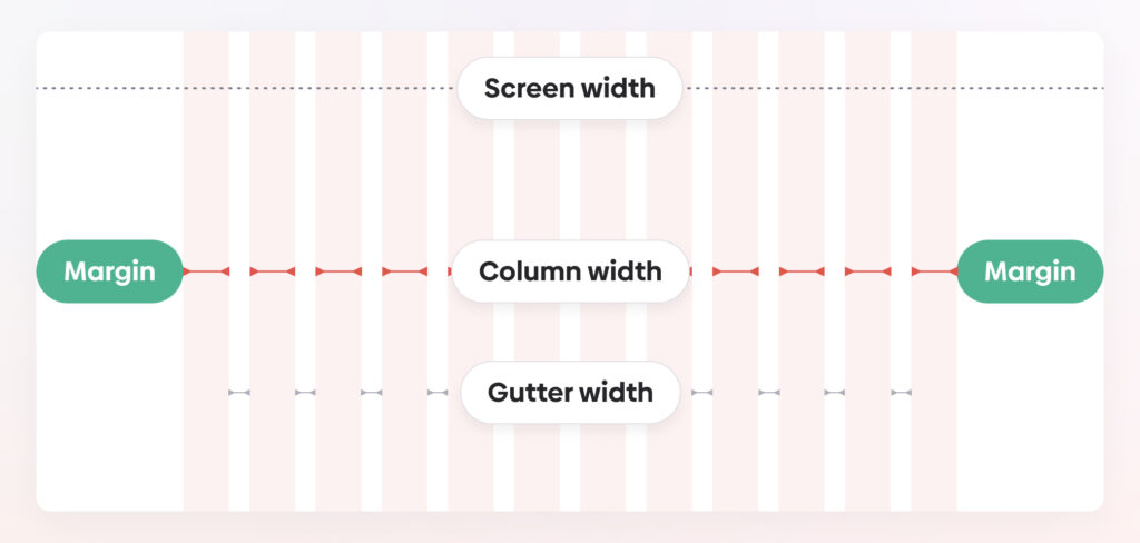
A grid system is a set of horizontal and vertical lines that divide a layout into sections. These sections guide where content should go, keeping everything aligned and balanced. Grids make designs easier to read and navigate.
Common Types of Grids
- Column Grid: Divides the layout into vertical sections. Great for responsive web designs.
- Modular Grid: Creates a grid of rows and columns, often used for dashboards or catalogs.
- Baseline Grid: Focuses on aligning text to horizontal lines for better readability.
- Hierarchical Grid: A flexible grid tailored to fit the content, often used in creative layouts.
Why Use Grids?
- Consistency: Grids make layouts look professional and organized.
- Ease of Use: They guide users' eyes, making it easy to find important information.
- Faster Design: Designers can place elements more quickly and focus on creativity.
- Responsive Design: Grids adapt well to different screen sizes, keeping designs functional on all devices.
How to Use a Grid System
- Pick a Framework: Tools like Bootstrap or CSS Grid make it easy to start.
- Set Margins and Gutters: Leave enough space between sections to avoid clutter.
- Test on Devices: Check how your grid works on different screen sizes and adjust as needed.
Conclusion
Grids are the foundation of great UI design. They bring order, improve usability, and make designs adaptable to different screens. By using a grid, you can create clean, functional, and visually appealing interfaces that users will love.
4o
Grid systems are a key part of modern UI design. They provide structure and help organize content, making interfaces look clean and easy to use. Without grids, designs can feel messy and confusing, which makes it harder for users to interact with them.
What Is a Grid System?
A grid system is a set of horizontal and vertical lines that divide a layout into sections. These sections guide where content should go, keeping everything aligned and balanced. Grids make designs easier to read and navigate.
Common Types of Grids
- Column Grid: Divides the layout into vertical sections. Great for responsive web designs.
- Modular Grid: Creates a grid of rows and columns, often used for dashboards or catalogs.
- Baseline Grid: Focuses on aligning text to horizontal lines for better readability.
- Hierarchical Grid: A flexible grid tailored to fit the content, often used in creative layouts.
Why Use Grids?
- Consistency: Grids make layouts look professional and organized.
- Ease of Use: They guide users' eyes, making it easy to find important information.
- Faster Design: Designers can place elements more quickly and focus on creativity.
- Responsive Design: Grids adapt well to different screen sizes, keeping designs functional on all devices.
How to Use a Grid System
- Pick a Framework: Tools like Bootstrap or CSS Grid make it easy to start.
- Set Margins and Gutters: Leave enough space between sections to avoid clutter.
- Test on Devices: Check how your grid works on different screen sizes and adjust as needed.
Grids are the foundation of great UI design. They bring order, improve usability, and make designs adaptable to different screens. By using a grid, you can create clean, functional, and visually appealing interfaces that users will love.
